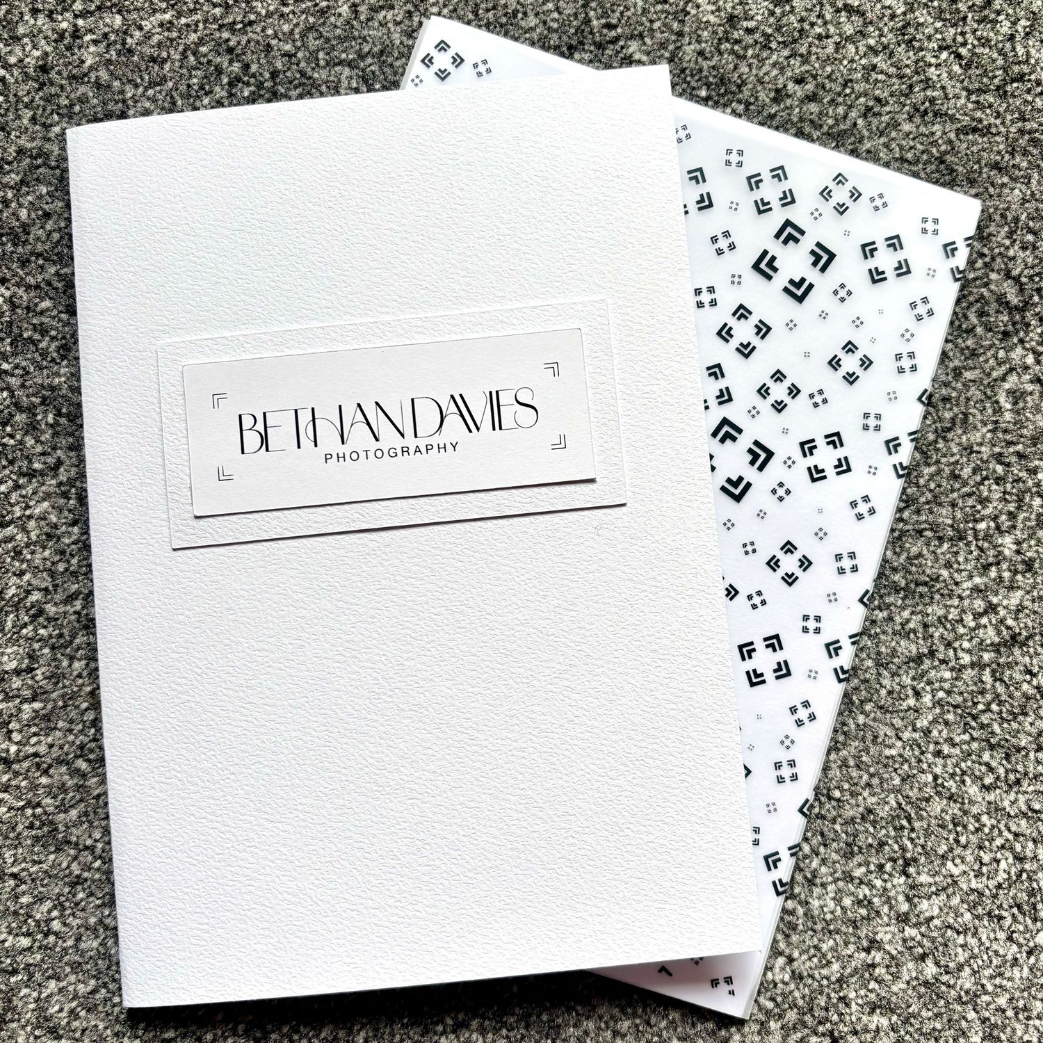
Photography is, at its heart, visual storytelling, so it felt important that the identity surrounding my work had a story of its own. Every element, from the typography and colours to the smallest details on the packaging, has been chosen to reflect the experience I want people to have when they step in front of my camera. The result is a visual identity that is minimal and contemporary, with subtle details that connect everything back to photography.
THE VISION BEHIND THE LENS
THE INSPIRATION FOR THE BRAND DESIGN
THE LOGO

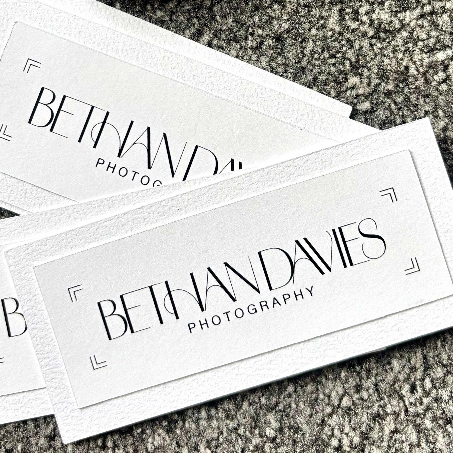
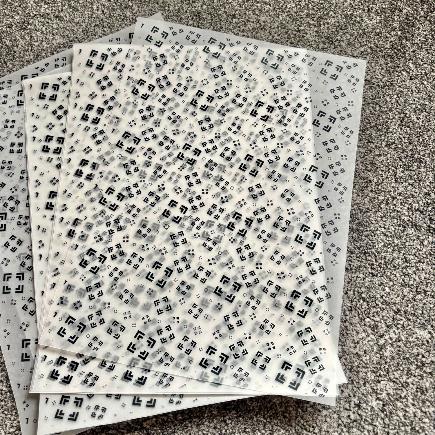
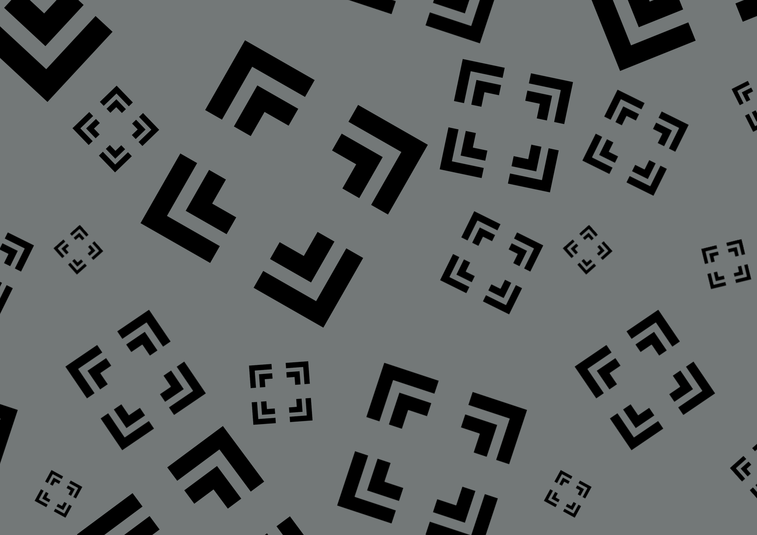
The logo I designed is deliberately minimal, with four corner markings inspired by a camera viewfinder. It’s a subtle nod to photography without relying on the more obvious cameras or lenses.
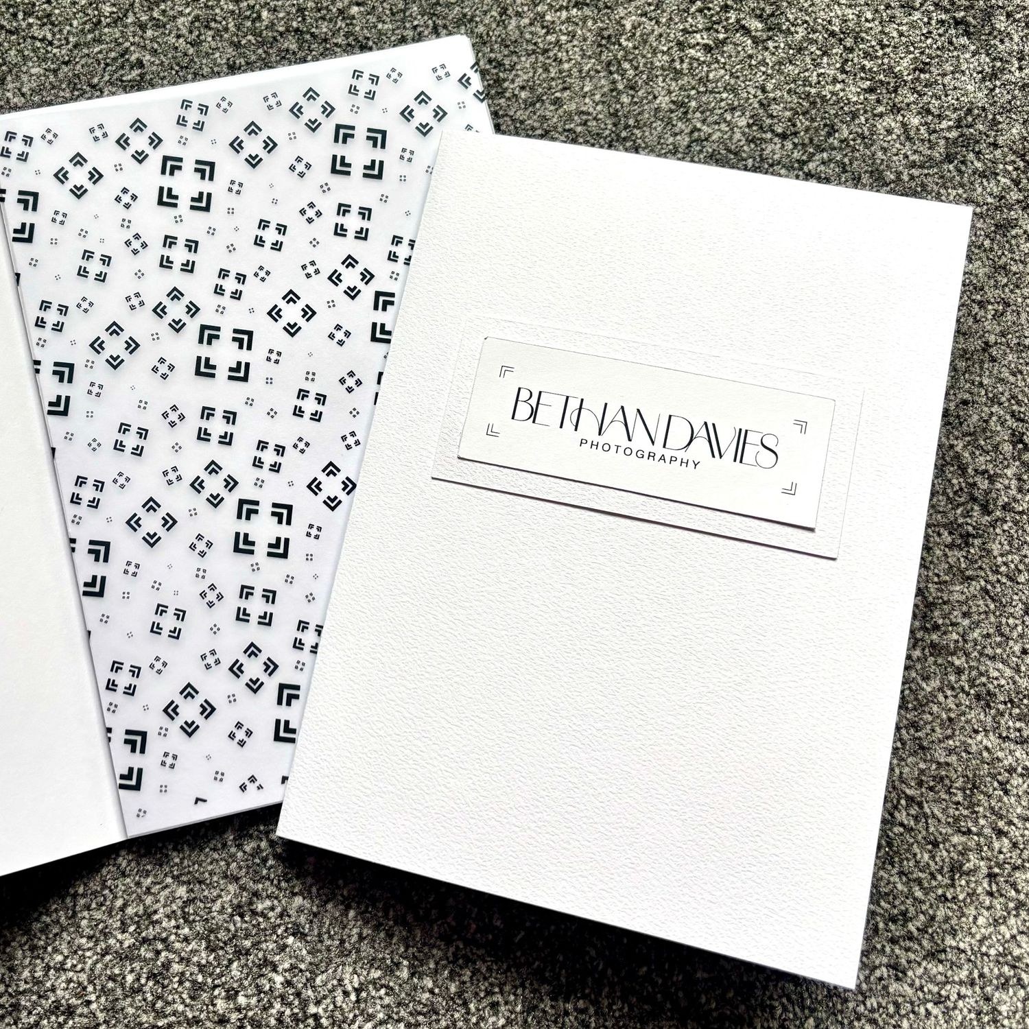
The markings have become a visual anchor for the wider brand, appearing across packaging, stationery, gallery materials and other assets. Even without the full logo, they create a small, recognisable signature that ties everything together.
THE COLOURS
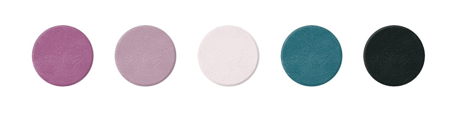
The colour palette came from somewhere much closer to home. Heather tones are a familiar sight across the Orkney landscape, while the surrounding sea often carries beautiful teal undertones.
The colours became the starting point for the two defining shades of the brand. Together, they capture the balance I wanted: creative but considered, warm but professional, and distinctive without overpowering the photographs themselves. Most importantly, they feel at home here.
THE FONTS
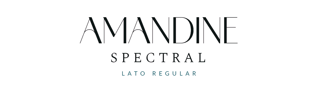
Typography was another opportunity to bring personality into an otherwise minimal identity. The fonts were chosen to give the brand a slightly elevated, boutique feel, but one of my favourite details is the use of alternative glyphs: different forms of individual letters that introduce subtle movement into the words.
That felt appropriate for a style of photography that isn't built around rigid posing. There's structure behind what I do, but I want people to have room to move and have fun.
THE TAGLINE
photography that reminds you how it felt, not just how it looked.
The tagline captures what I want my photographs to become. Beautiful images matter, but the real value is in preserving the emotion, connection and little moments that made the experience yours.
Whether it’s a wedding or a family session, my aim is to create photographs that do more than document what was there. I want them to bring you back to the people, atmosphere and feelings you experienced in that moment.
THE DETAILS
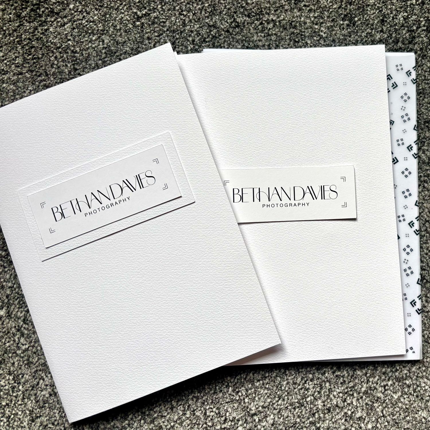
I wanted the brand to exist beyond the website, carrying the same small details into the final client experience. From the website to the final package, the same details carry through each part of the experience.
The viewfinder motif, typography and carefully chosen materials bring the identity into something tangible, creating a consistent finishing touch for every gallery I deliver.